Mastering Data Visualizaton with Altair's Grammar of Graphics'
Transform data into visualizations with Altair's powerful library for Python.
It was way back in 1999 that the late Leland Wilkinson wrote his seminal book, The Grammar of Graphics[1], in which he explained the notion that charts could be built from building blocks that were analogous to the grammar of a written language.
According to H2O.ai in their splendid tribute to Wilkinson (and where he became Chief Scientist), "The Grammar of Graphics provided a new way of creating and describing data visualizations, a language — or grammar — for specifying visual elements on a plot, which was a completely novel idea that has fundamentally shaped modern data visualization."
Ten years later came what is probably the most well-known implementation of the idea, ggplot2, the R language charting library which was developed by the New Zealand academic, and current Chief Scientist at RStudio, Hadley Wickham. He explained ggplot2 in his paper A Layered Grammar of Graphics and his book ggplot2[2]. ggplot2 has become one of the most popular R packages.
If you are a Pythonista you may think that ggplot2 and the grammar of graphics are not very relevant to you because there is little support for it in Python graphics libraries (with the notable exception of Plotnine, an implementation of ggplot2 in Python).
Well, maybe you should think again.
ggplot is not the only graphics library that implements a grammar of graphics. In 2017 the paper Vega-Lite: A Grammar of Interactive Graphics[3] described a grammar that had been extended to include interaction in addition to visual encoding.
Vega-Lite began at the University of Washington but as its original authors have moved, work has migrated to other institutions like Stanford and MIT. It encodes graphics as a JSON structure which can be compiled into interactive web-based graphics and thus displayed directly in a web page or a Jupyter Notebook.
Hard on the heels of Vega-Lite came Altair[4] a declarative statistical visualization library for Python that was based on Vega-Lite and that enabled data visualizations to be constructed in Python and displayed on the web.
In this article, I am going to briefly introduce the Vega-Lite grammar of graphics and then see how we can produce compelling data visualizations using Python and the Altair graphics library.
I'll use Jupyter Notebooks to introduce Altair but we could also easily create an Altair-based data visualization app using Flask or Streamlit.
A Colab notebook with all of the code in this article is available here: (Google Colab)
What is a Grammar of Graphics
Instead of choosing the type of plot that your data would fit, a grammar of graphics approach is more exploratory and starts with the data. You first look at the data and then decide how it would be best represented: what parts of the data should be mapped onto which visual properties of the chart.
As I mentioned before, the grammar of graphics can be thought of as using a set of building blocks that are combined to form a visualization. The basic components are these:
-
Data: This can be a table, CSV file, or some other format that contains the data that represents the information that you want to visualize. We will be using a CSV file that is read into a pandas dataframe.
-
Marks: These are shapes used to represent data, such as lines, bars, points and circles.
-
Encodings: These define how data are mapped to the marks. For example, which data columns are mapped to the x- and y-axes, or define the colour, size, etc.
-
Transforms: These are operations that are applied to the data before it is visualized, for example, filtering, aggregating, or sorting. Transforms are optional - you may not need them.
A very quick look at Vega-Lite
To give you a flavour of what it looks like, I have constructed a simple Vega-Lite specification, below.
As we can see it is a JSON structure that encodes the elements discussed above. Among other things, you can see the dataset, encoding and mark elements. The data element contains the actual data in JSON format; it consists of a list of months and corresponding mean temperature values for each month (this is, in fact, a small subset of the weather data that we will use later).
import altair as alt

spec = {
  "$schema": "https://vega.github.io/schema/vega-lite/v5.14.1.json",
  "data": {
    "name": "data-ed9a828c9c0483f5e407159194ad5119"
  },
  "datasets": {
    "data-ed9a828c9c0483f5e407159194ad5119": [
      { "Month": 1, "Tmean": 5.4},
      { "Month": 2, "Tmean": 7.65},
      { "Month": 3, "Tmean": 9.05},
      { "Month": 4, "Tmean": 10.9},
      { "Month": 5, "Tmean": 15.15},
      { "Month": 6, "Tmean": 17.55},
      { "Month": 7, "Tmean": 21.35},
      { "Month": 8, "Tmean": 21.45},
      { "Month": 9, "Tmean": 16.0},
      { "Month": 10,"Tmean": 14.35},
      { "Month": 11,"Tmean": 10.4},
      { "Month": 12,"Tmean": 4.8}
    ]
  },
  "encoding": {
    "x": {"field": "Month", "type": "ordinal"},
    "y": {"field": "Tmean", "type": "quantitative"}
  },
  "mark": {"type": "line"}
}
In addition to the data, we see in the encoding element that the 'Month' column is on the x-axis and is an ordinal type and on the y-axis is the temperature value which is a quantitative type. Finally, the type of mark to be used in the graph is 'line'.
The result of rendering this specification is shown below: a simple line chart of temperature over 12 months.
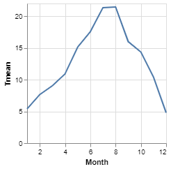
This gives you a flavour of Vega-Lite but we won't go any further in exploring it, here; the rest of the article will focus on how we construct Vega-Lite charts using the Altair Python library and we'll talk more about encodings, types and marks in that context.
Altair
Altair is a Python visualization library that implements the grammar of graphics from Vega-Lite. We can create interactive graphics directly in Python that can be automatically rendered as charts in Jupyter Notebooks, on the web or in Streamlit.
Of course, the first thing we need to do is to install the library.
pip install altair vega_datasetsor
conda install -c conda-forge altair vega_datasetsFor this article you won't need vega_datasets but they are useful if you want to explore
further without the bother of having to find your own data.
We are going to use data from my own GitHub repository that records historical weather data about London, UK. It records temperatures, hours of sunshine and rainfall over several decades[5].
If you want to follow along with the coding, open a Jupyter Notebook and place each new section of code in a new cell, or open the public Colab notebook in a separate window where you can view and execute the code.
The first piece of code we need imports the libraries and the data.
# import libraries
import pandas as pd
import altair as alt

url = "https://github.com/alanjones2/uk-historical-weather/raw/main/archive/Heathrow-to-2023.csv"

df0 = pd.read_csv(url)
df = df0[df0['Year'] == 2022][['Month','Tmax','Tmin','Tmean','Rain','Sun']]
I've created a subset of the data that only covers 2022 (the latest year where the data is complete) with the columns shown above.
The dataframe df0 contains the full dataset and df contains the 2022 data.
The
2022 data looks like this:
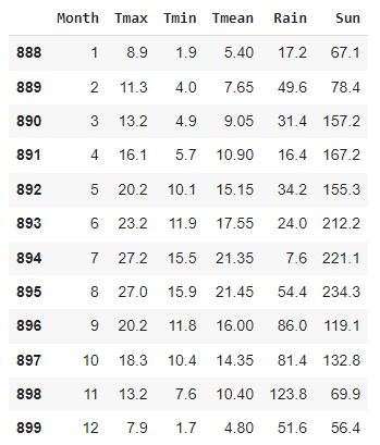
Ignoring the first index column, the data columns are the month, the maximum temperature in that month, the minimum temperature in that month, the mean temperature for that month, the total rainfall in millimetres for the month, and the total number of hours of sunshine.
Now, we can construct an Altair chart.
# Construct a chart
alt.Chart(df).mark_point()
This is the basic syntax for constructing an Altair chart: we are using the Chartmethod
from
the Altair library, passing it the data and specifying that the mark type is a point.
This doesn't do very much because we haven't included any encodings: we are not saying what data to map onto the x- and y-axes, for example. So, all we get is a point plotted for every data point in the dataframe and they are all plotted on top of each other.

Not very exciting. Let's add some encodings.
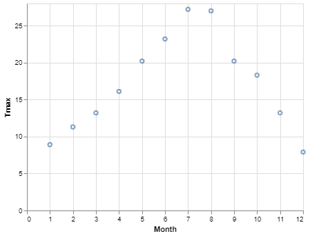
# Add a y encoding
alt.Chart(df).mark_point().encode(
    x = 'Month',
    y = 'Tmax')
Here we've told Altair to encode theMonthcolumn to the x-axis and the Tmax
column to the y-axis and from this, we will get a two-dimensional graph that shows how
Tmaxvaries over Month. Pretty easy.
That's fine but maybe we would could more easily compare those temperatures with a bar chart. Let's change the mark type to 'bar'.
# Change the mark to 'bar'
alt.Chart(df).mark_bar().encode(
    x = 'Month',
    y = 'Tmax')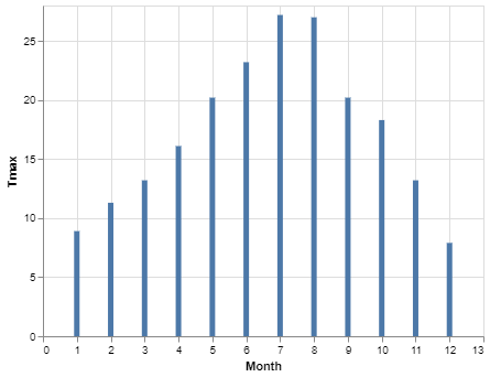
This is less than ideal as the 'Month' column is being interpreted as a quantitative value rather than an ordinal one (notice the space between the integers on the x-axis where you could, theoretically, plot a value at say x = 4.6 which, in this context, is of course nonsense). We need to take a quick look at data types in Altair.
Data Types in Altair
There are four fundamental data types:
- Quantitative: numbers that represent quantities such as the temperature data above.
- Nominal: these are names or other non-ordered categorical data such as people's actual names.
- Ordinal: these are categorical data that have an order such as the months in the data above.
- Temporal: these are dates and times.
Altair cannot always determine the correct type but we can help it by specifying the type in the encoding. We do this by adding 'Q', 'O', 'N', or 'T' to the name of the column preceded by a colon. The next code cell does just this and specifies the month data as ordinal. (No need to tell Altair that 'Tmax' is quantitative because that column contains real numbers so couldn't really be anything else.)
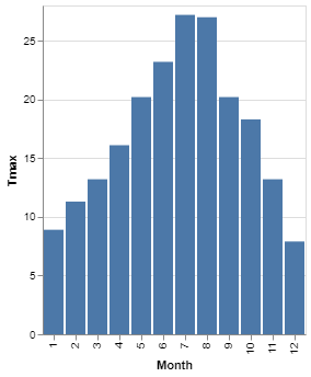
# Change the month type to ordinal
alt.Chart(df).mark_bar().encode(
    x = 'Month:O',
    y = 'Tmax')
With a bar chart, it is useful to make sure that the value that encodes each bar is labelled as categorical. In the example here, the month is an integer and the value is a float. Both could be regarded as quantitative, so without any further information, Altair cannot tell where the base of the chart should be - it therefore assumes that it is the x-axis. If you tell Altair explicitly what the baseline of the bar chart should be by declaring it as some sort of non-quantitative value - in this case ordinal - it will treat this as the base of the chart. Additionally, when the base is declared as ordinal, the column sizes are automatically adjusted to fit the scale better.
Would you prefer a horizontal bar chart? Many charting libraries will have different chart types for a column chart and a (horizontal) bar chart but, as we are discovering, Altair does not have chart types - it is up to you to describe how the data is displayed whether it is as some conventional chart type or something entirely of your own invention.
If you want the bars to be horizontal, rather than vertical then you simply specify that. the base of the chart (in this case, 'Month') is encoded onto the y-axis and the value to be plotted is encoded onto the x-axis.
# Change the mark to 'bar'
alt.Chart(df).mark_bar().encode(
    y = 'Month:O',
    x = 'Tmax')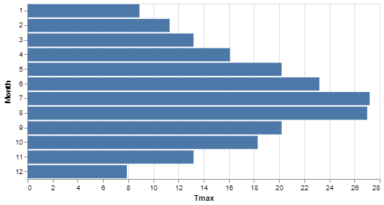
Simple chart parameters
Let's deal with a few simple things: change the size of the chart, the colour and how to display more than one chart in a figure.
You can see in the image below that we've done each of these things and it is remarkably easy.
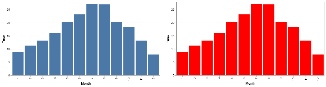
First, we set height and width parameters on the chart itself, then a color parameter on the mark. Finally, we use a simple syntax to tell Altair how the two charts should be arranged. Here is the code:
blueChart = alt.Chart(df, height=250, width=500).mark_bar().encode(
    x = 'Month:O',
    y = 'Tmax')

redChart = alt.Chart(df, height=250, width=500).mark_bar(color='red').encode(
    x = 'Month:O',
    y = 'Tmax')

blueChart | redChart
It's all very straightforward. You can see the parameter that we have set and that this time instead of displaying each chart we assign each one to a variable. To display the resulting figure we give the variable names separated by the pipe symbol; this gives us a facetted view.
More marks: lines, circles and areas
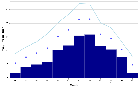
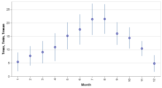
Let's see some more marks and ways of combining traces. The following figure, I will admit is not the most attractive chart I've ever created but it serves to show how we can combine more than one trace on a chart and also illustrates a couple more marks: the circle and the line.
Here we see the three temperatures, Tmax, Tmean and Tmin,
plotted
in different colours and with different marks all on the same chart.
We use almost the same approach as last time; creating separate plots, assigning them the variables and then displaying them together.
TmaxChart = alt.Chart(df, width=500).mark_line(color='lightblue').encode(
    x = 'Month:O',
    y = 'Tmax')

TmeanChart = TmaxChart.mark_circle(color='blue').encode(
    x = 'Month:O',
    y = 'Tmean')

TminChart = TmaxChart.mark_bar(color='darkblue').encode(
    x = 'Month:O',
    y = 'Tmin')


TmaxChart + TminChart + TmeanChart
As before we have different plots assigned to variables - three this time - but they are combined
with
the +symbol which draws each of the plots in the same chart.
Notice we have used mark_line, mark_circleand mark_barto plot
the
different temperatures. This was simply to show those different marks but a more attractive solution
would be to use mark_areato plot the three values. In the image below the different
marks
have each been replaced by mark_area, otherwise the code is identical.

Text annotations
We don't want to make our charts too busy but sometimes it is useful to add textual annotations in order to make them clearer. The bar charts of temperatures that we have seen give a good overview of the data but don't let you see the precise temperature for a month.
If this sort of accuracy is important to us we can add text to the top of the bar that shows the actual temperature as is the figure below.

This uses anothe mark, mark_text. And we use it as seen in the code below.
TmaxChart = alt.Chart(df, width = 500).mark_bar().encode(
    x = 'Month:O',
    y = 'Tmax:Q')

text = TmaxChart.mark_text(
    dy=-5  # Nudges text up so it doesn't appear on top of the bar
).encode(
    text='Tmax:Q'
)

TmaxChart + text
Again, we are creating two plots and combining them. The first plot is the bar chart that we have
seen
before and the second builds on that chart and adds text to it. We need to tell it what text to use
(Tmax) and there is a slight tweak to the position of the mark. We have various ways of
displaying and formatting the text and the attribute that we are using here, dy, moves
the
text in a vertical direction so that it is positioned just above the columns that it refers to.
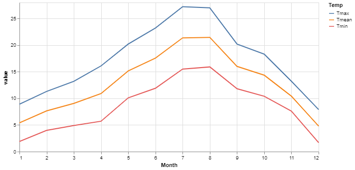
Areas again
We have seen the basic area chart used to display the three temperatures which were layered on top of each other. The area mark can also take a second y parameter which has the effect of marking the area between those two plots.
Taking our three temperatures, again, we are going to mark an area between the maximum and minimum temperatures and then draw the mean temperature as a line plot on top of the area. This will give us the effect of displaying the mean with a range marked around it.

Here's the code:
range = alt.Chart(df).mark_area(opacity=0.5).encode(
    x = 'Month',
    y = 'Tmax',
    y2 = 'Tmin'
)

mean  = alt.Chart(df).mark_line(color='darkblue').encode(
    x = 'Month',
    y = 'Tmean'
)

(range + mean).properties(width=500, height=250)
Again, two combined plots. The first plot sets the two y axes to the max and min temperatures. It also sets the opacity of the marked area to be somewhat transparent.
The second plot is a simple line plot of the mean temperature in dark blue.
I've combined the two plots as before but notice that by bracketing them together, I can set parameters for the resulting plot - here I've set the size.
We can use bar and point marks to represent the same data in a rather different but still conventional, way. Consider the following chart.
Here we've got almost identical code to the previous version: the first trace uses a bar which has a width of 1 to make it more of a line than a bar, and the second trace is a point instead of a line.
tmax = alt.Chart(df).mark_bar(width = 1).encode(
    x = 'Month:O',
    y = 'Tmax',
    y2 = 'Tmin')

mean  = alt.Chart(df).mark_point(color='darkblue').encode(
    x = 'Month:O',
    y = 'Tmean'
)

(tmax + mean).properties(width=500, height=250)
Both charts display the same information but in rather different ways and we achieve that difference not by specifying a particular type of plot but by simply describing what we want in Altair's grammar of graphics.
A histogram
What is a histogram? Essentially, it is a column chart that shows a count of some data points rather than the data points themselves.
What if we wanted to see how many sunny months there were in London in 2022. First, we need to decide how much sunshine makes a sunny month. Should a sunny month be one with more than a fixed number of hours of sunshine?
How about, instead, we categorise months by the number of hours of sunshine? The gloomiest month was December with 56.4 hours of sunshine while the sunniest was August with 234.3 hours. The other months are somewhere in between.
We can ask Altair to bin values, i.e. put the data in a bin that represents a range of values. We can also ask it to count the number of data points in each bin. Next, we can display the counts in a bar chart. And, of course, I am describing the operations that we need to make a histogram. The chart itself is simply a column chart of the counts in each bin.
alt.Chart(df, width = 500).mark_bar().encode(
    alt.X("Sun", bin=True),
    y ='count()'
)
Correlations
If you are not a data scientist then using a regression line on a scatter diagram may not be the most obvious way to show a correlation.
Is there a correlation between the number of hours of sunshine and the maximum temperature in a month? I think we probably know the answer to this but let's think about how we could demonstrate it.
We could plot the temperature and the hours of sunshine on the same graph and see if, as one moves up or down, the other follows. The problem is that the units of measurement and the range of values are quite different for temperature and sunshine.
Here's a first attempt to show a correlation.
TmaxChart = alt.Chart(df, width = 500).mark_line(color='darkred').encode(
    x = 'Month',
    y = 'Tmax')

SunChart = alt.Chart(df, width = 500).mark_bar(color='darkorange', width = 20).encode(
    x = 'Month',
    y = 'Sun')

TmaxChart | SunChart
We get two graphs side-by-side and while we can see the correlation, wouldn't it be better to have both traces on the same chart?

If we simply use the +operator to combine the charts we will get a line plot that goes
nowhere near the top of the chart and it would be difficult to see that the patterns of the two
plots
match. And besides, as we said earlier, the units are different so it m little sense to plot them as
if
they were the same.
The answer is to have two independent y-axes; one for the temperature and the other for the sunshine.
The code below calls the resolve_scalemethod and passes it a parameter that overides the
default and gives an independent y-axis to each plot.
(SunChart + TmaxChart).resolve_scale(y='independent')The result gives us a much better impression of the correlation between the two values.

But what's that I hear you say? You are a data scientist and you want to see a proper scatter plot with a trend line. Oh, all right just for you...
chart = alt.Chart(df, width = 500).mark_point().encode(
    x = 'Tmax',
    y = 'Sun')

trend = chart.transform_regression('Tmax', 'Sun').mark_line()

chart + trend
We use mark_pointto show the data points and map 'Tmax' and 'Sun' to the x- and y-axes,
respectively. Then we create a line chart which is a regression line and display the two plots
together.
Enough!
In this introduction to Altair, we've seen how the elements of the grammar of graphics are used: we've used different marks such as points, lines, bars and areas; we´ve seen how to encode data to different aspects of a chart; and we've used bins and regression as examples of transforms.
I could go on and explore other charts but I hope I've said enough to persuade you that the grammar of graphics approach is a powerful one. But before I conclude there is one more thing that I should discuss.
Long vs. Wide Data
Altair tells us that it is best used with long data but the dataframe that I have used here is wide. What's the difference and why would I use one or the other?
The first column in a wide data table contains unique values. In the data that we have been using the first column contains values for each month and each row contains observations for that month.
Long data contains repeated values in the first column and combines the wide columns into fewer columns. Long data has one row per observation.
Here's what I mean: the dataframe on the left is wide, and the other is long but they contain the same data.

The wide format data has one row per month and each temperature has its column. In contrast, the long data table has one row for each observation, i.e. the temperature value; it combines all of the temperatures in a single column and adds a column to label those temperatures. Consequently, the entries in the 'Months' column are repeated for each temperature (in the image this has been cut off but you get the idea).
Why would you choose one form or the other?
Probably, from the point of view of a human reader, the wide format is easier to read. With long data it is easier to add a new column: for example, if we wanted to record which day of the week the temperature was taken, we would only need one extra column that specified the day. Also, many graphics packages expect a long format.
We have got this far using wide data but let's take a quick look at how using the long format can be helpful in Altair.
First, we need to create a long-form dataframe in Pandas. For this, we use the
meltmethod.
dfn = df.melt(['Month'],
              var_name='Temp',
              value_vars=['Tmax','Tmin','Tmean'])
I won't go into all the possible options, you can look up meltin the Pandas documentation.
What
we need to know here is that we take our original dataframe and define the columns that we want in
the
long data. The first parameter simply tells us that we want to use the 'Month' column from the
original
dataframe. The second parameter says that we want another column called 'Temp'. And the third tells
us
the values from the original dataframe we want in the new column.
That single Python statement will generate the long data that we saw above.
Here is how we can use it.
alt.Chart(dfn, width=600, height=300).mark_line().encode(
    x = 'Month',
    y = 'value',
    color = 'Temp'
)
This is a single chart but because we have told Altair to use the 'Temp' column to colour the traces, and as that column contains three unique values, it plots three traces.
We can do something similar with a bar representation.
alt.Chart(dfn, width=600, height=300).mark_bar().encode(
    x = 'Month:O',
    y = 'value:Q',
    color = 'Temp:N'
)
Here we have changed the mark to a bar and Altair will automatically plot three different bars for each month. By default the bars are concatenated one on top of the other to each other, that is, it is a stacked bar chart.

In this instance, a stacked bar is not a great interpretation of the data; adding the three values together doesn't make much sense and we cannot easily see what the individual bars represent.
If we don't want the bars to be added together then, rather than specify stacked versus grouped as you might do with other graphics libraries, we tell Altair what we actually want. A grouped bar chart has separate bars that are offset from each other on the x-axis. So, we tell Alatair to do precisely that.
alt.Chart(dfn).mark_bar().encode(
    x="Month:O",
    xOffset="Temp:N",
    y="value:Q",
    color="Temp:N",
)
In the code above we have added a new attribute, xOffset="Temp:N", this instructs Altair
to
offset the bars using the 'Temp' column. The result is individual bars for each 'Temp'.

So, with long data, we can create charts with very concise code using the color
attribute to
encode individual traces.
Short- and long-form attributes
Up until now we have seen attributes of the form x = 'Temp'. This is short for
x = alt.X('Temp'), a call to theXmethod in the Altair library. The short
form
is useful when there are no additional parameters to supply to the method. Here's the code that is
equivalent to the previous code cell but using the long form.
alt.Chart(dfn).mark_bar().encode(
    x=alt.X("Month:O"),
    xOffset=alt.XOffset("Temp:N",sort=['Tmin', 'Tmean', 'Tmax']),
    y=alt.Y("value:Q"),
    color=alt.Color("Temp:N"),
)
As you can see the method names are a capitalised version of the attribute names. The advantage of
using
this explicit way of invoking a method is that we can add additional parameters such as
sortthat is used to change the order of the bars in the chart in the code above.

As you can see the bars are now ordered Tmin, Tmean and Tmax.
Each of the other parameters can take further parameters to alter their behaviour (see the Altair API documentationAPI).
Conclusion
OK, that really is enough. There is, as you might guess a great deal more that I could discuss and demonstrate. Thank you for reading and well done for getting to the end of the article.
Using a grammar can be a powerful way of approaching the construction of a chart or graphic and I hope that I've shown you a glimpse of that power. That is not to say that it is a panacea. Some charts require more than simple building blocks and there are well-known chart types that are often a known solution to a problem. In these cases, a more conventional charting library, such as Plotly, might be more appropriate.
I intend to create a Data Visualization Recipes blog in the not-too-distant future that will publish short examples of the usage of various graphing libraries (Altair, for sure, but Plotly, Matplotlib and others, too) and related tools (Streamlit, for example). If you would like to be among the first to know when this is first published, be sure to subscribe to my occasional free newsletter on Substack.
Notes
- The Grammar of Graphics (Statistics and Computing) 2nd Edition (2005) is listed on Amazon. It's not cheap!
- The third edition of Hadley Wickham's book ggplot2 is available online but is said to be a work in progress. The second edition is listed on Amazon as a paperback or ebook.
- Vega-Lite: A Grammar of Interactive Graphics, Arvind Satyanarayan, Dominik Moritz, Kanit Wongsuphasawat and Jeffrey Heer, IEEE Transactions on Visualization & Computer Graphics (Proc. IEEE InfoVis), 2017
- Altair: Interactive Statistical Visualizations for Python, Jacob VanderPlas, et al. _Journal of Open Source Software, 3(32), 1057
- UK historical weather data is from my GitHub repository. The data is derived from from UK Met Office file information (Open Government License). For more details see the readme file in the repo.
Streamlitfrom Scratch
Streamlit is a framework for creating Data Science apps in Python.
Streamlit from Scratch is an ebook that will teach you how to get started with
Streamlit.
How Charts Work: Understand and explain data with confidence
From the Back Cover
How Charts Work brings the secrets of effective data visualisation in a way that will help you bring data alive. Charts, graphs and tables are essential devices in business, but all too often they present information poorly. This book will help you:
The Art of Statistics: How to Learn from Data
Discover how data literacy is changing the world and gives you a better understanding of life's biggest problems. I have used this book in various articles and found it to be invaluable.Storytelling with Data: A Data Visualization Guide for Business
Don't simply show your data - tell a story with it! Storytelling with Data teaches you the fundamentals of data visualization and how to communicate effectively with data. I use this book in the series of articles '12 Essential Visualizations and How to Implement them.How Charts Lie: Getting Smarter about Visual Information
A leading data visualization expert explores the negative - and positive - influences that charts have on our perception of truth. I used this book as the inspiration for 'How Not to Lie with Charts'.Plotting with Pandas
Plotting with Pandas: an Introduction to Data Visualization is an ebook that covers basic and statistical plots using Python and Pandas, line and bar charts, scatter plots, pie charts, histograms, box plots, etc.